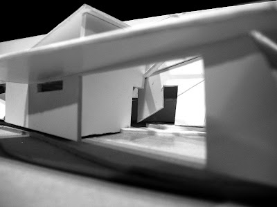
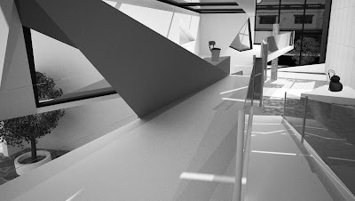
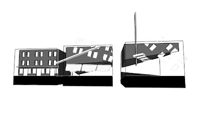
pdf of presentation boards at:
Sunday, June 13, 2010
Saturday, June 12, 2010
design 3 - site analysis


newtown is an eclectic mix of retail, restaurants and culture clearly visible as you move along the major strip of King Street. Both busy with vehicle's and foot traffic, the area is rapidly becoming a popular area for socialising and is being populated by niche brand stores and trendy gallery's...making it the perfect position for an artist with a mind for consumption that is generated by alternativism.
 the far quieter wilson street is predominately made up of residential lots, but features a larger amount of vegetation and far fewer vehicles. This creates an interesting contrast to king street, both connected by erskineville road and site 2.
 the majority of facades on king street are of heritage era and have a definate neo-classical aesthetic. awnings float above the footpath with light boxes procariously dangling above pedestrians. glass was in limited supply when the original buildings were designed, so it is used sparingly, and exactly over each facade to create delicate appatures for occupants to view through. the more modern retail entrances celebrate glazing and invite shoppers inside.
Sunday, May 30, 2010
design 3 - art gallery so far
the artist I have chosen to design a gallery for is Martino Gamper, an industrial designer that basically pulls things apart and puts them back together again. i believe he is an artist and not just a furniture maker because he does it with great craftmanship, in a respectful way to the original designs and makes one question the value of disused furniture. the results are often sprinkled with humour, but are not only sculptural, but functional pieces aswell.


in 2008 he displayed a series of furniture made from reclaimed Carlo Mollino chairs. the concept of pulling apart something common and recognisable and piecing it back together to create something completely new could result in interesting architecture, especially in an area such as Newtown where there is a strong vernacular of building.  original Carlo Mollino chair above - Martino Gamper's interpretations below

 other architectural cues that can be taken from his work are his fascination with corner, his ability to transform a flat plane with angular detailing, and the forms of some pieces.
 original Carlo Mollino chair above - Martino Gamper's interpretations below
 other architectural cues that can be taken from his work are his fascination with corner, his ability to transform a flat plane with angular detailing, and the forms of some pieces.

 some of the concepts i will explore is the dis-asseblage of spaces, from what is expected along a retail strip such as Newtown, to offer something different whilst remaining functional.
 to remain 'inkeeping' with the other architecture in the area, a dis-assemblage of a building facade will create a modern interpretation of the common heritage facade's of the area.
Subscribe to:
Comments (Atom)


